Brand usage

We are thrilled to present Coppe’s new Brand Manual: an essential guide to understanding and applying our brand identity consistently and effectively across a variety of digital and printed media.
The Coppe brand is a valuable asset that strengthens our reputation and credibility, and attracts interest in the institution. Its identity is formed by visual and conceptual elements that reflect our essence, values and purpose. Our identity combines sobriety and avant-garde, highlighting our legacy of more than 60 years and our vision for the future, focused on innovation and cutting-edge technology.


The successful implementation of this manual depends on the collaboration and commitment of everyone. It is vital that we all understand and follow the established guidelines, regardless of our role.
This way, we ensure that our brand is represented consistently and with integrity, reinforcing our image and the impact we seek to achieve.

It is the gateway for who we are: innovation and excellence.
The new visual identity united sobriety and avant-garde, translating the strength of our past with a gaze turned to the future, to cutting-edge technology and innovation which defines us.
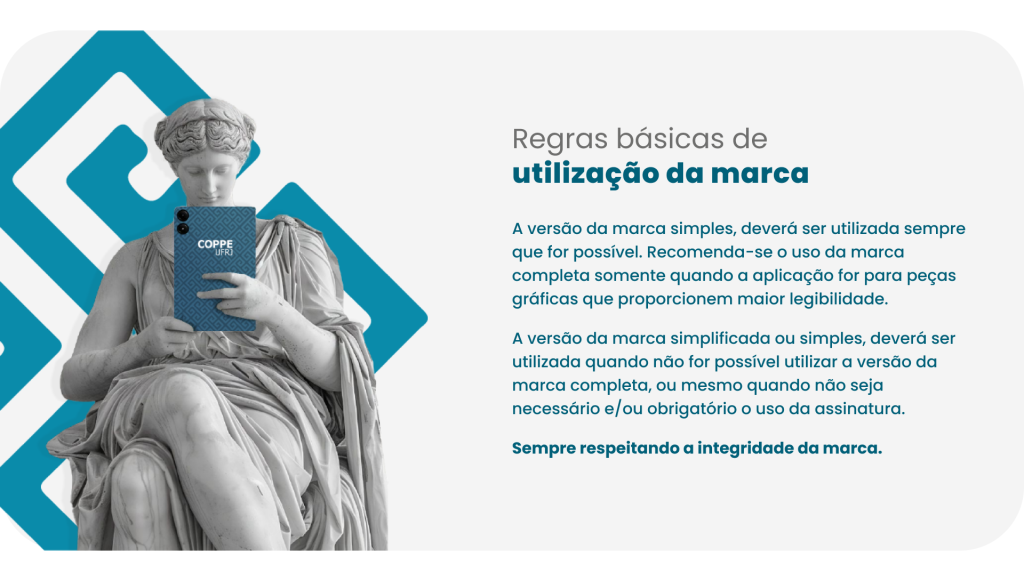

Correct
Do not rotate
Do not impair legibility
Do not exclude elements
Do not use vibrant backgrounds
Do not alter the proportion
Do not alter the alignment
Do not alter to colors other than the main ones accounted for in the manual


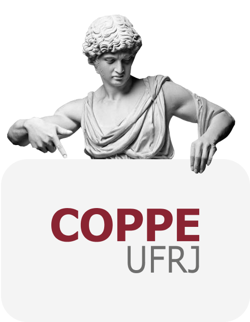
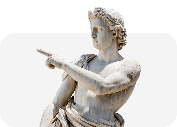
Principal
Negative
Positive

Institutional graphic pieces play a fundamental role in organizing and building a visual identity. More than just aesthetic elements, they are strategic communication tools.
Here you’ll find the layout of institutional pieces to ensure the correct application of Coppe’s visual identity across different materials and communication contexts.


We hope this Manual is not just a compendium of guidelines. It was designed to provide practical guidance on the use of the brand in all our activities, serving as a helpful tool for everyday reference.
If you have any questions or needs that were not covered in this manual, please contact Coppe’s Visual Programming/Communications Department by e-mail: asscom@adc.coppe.ufrj.br


Why do we need a brand manual if we are not a company?
A brand is the gateway to an organization, whether it’s a company, a public body, an educational institution, among others.
The manual serves as a script that ensures that our brand is presented in a cohesive and consistent way in all points of contact, creating a strong and recognizable impression to our public. Consistency is a key element, preventing the dilution and converging the strength of our brand.
Respecting these parameters is fundamental for all materials to be integrated, thus ensuring communication unity and consolidating the institutional image.
What is a brand manual and what is it for?
Visual identity is made up of the set of visual and conceptual elements that represent and distinguish the brand. Identity encompasses all the elements that form our image, from the logo, typography, color palette and visual form—the images we use.
Is this manual designed for design agency professionals?
Designers, communicators, managers and any other professional involved in the creation and/or distribution of content—in digital and print media—should familiarize themselves with the manual and apply it correctly. This way, we ensure that our brand is represented consistently and with integrity, reinforcing our image and the impact we seek to achieve.
Can anyone use the Coppe brand?
The use of a brand is subject to legal regulations, and its ownership is the exclusive right of its owner. The Coppe brand must be used in accordance with the instructions provided in this Visual Identity Manual.
The image set will only be available to external institutions or private companies with the express authorization of Coppe’s board of directors. Any unauthorized use, disclosure or reproduction of Coppe’s name, image or logo is subject to appropriate administrative and/or legal action.
Our brand constitutes an asset and must be managed by everyone.
If you have any questions or require guidance, please contact Asscom – asscom@adc.coppe.ufrj.br
What has changed in comparison to the previous material?
Since the previous manual was created before the proliferation of digital communication, it was based solely on print formats and did not anticipate applications in digital media. Therefore, the new version brings some new features:
Parameters for photographs that should portray Coppe as a vibrant, diverse, and welcoming place, showcasing the entire community involved in the university, the practical learning and the personal fulfillment of each individual.
Establishing a hierarchy in the coexistence of different brands – between programs and laboratories – requires establishing certain criteria that facilitate understanding for all audiences, not just internal ones.
Another update concerns the use of colors. In this new version of the manual, we offer a color palette that will bring more diversity and vibrancy to applications, including cross-cutting themes.
The creation of an allegory – graphics that add rhythm and dynamism to the visual language.
I didn’t find any guidance for applying the brand. What should I do?
If you have any questions or needs that were not covered in this manual, please contact Coppe/UFRJ’s Visual Programming / Communications department.